One parent mark, three businesses
A pan-African holding company with three businesses under it. The job was to refine the existing logo and build the group site around it.
- Client
- The Ogese Group
- Year
- 2026
- Scope
- Logo refinement, Web design, Build

(Overview)Built to be moved through, not looked at. The film is the only honest capture.
(The brief)The three businesses are Ogese Media, Ogese Ventures and Ogese Makao, and they trade in different markets across the continent. A reader arriving because of one of them will not know the other two exist, and the site had to fix that in the first screen.
Colour
- Primary Ogese Onyx #1A1816
- Secondary Warm Grey #7A726B
- Accent Deep Gold #B8962E
- Ground Ivory #F5F0E8
Type
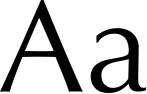
Optima leads. Playfair takes the longer reading.


(The problem)Media, ventures and real estate do not look alike, and should not. The group logo had to sign all three without dressing them the same.
(What shipped)Optima leads and Playfair takes anything longer than a heading, so a short line and a long paragraph never sit in the same voice. The colours are onyx, warm grey and deep gold. Each of the three businesses gets its own section under a group logo that does not change from one section to the next.


Three businesses that share nothing but a parent, and one logo that says so.
More work


